

Thursday, September 16, 2010
Essay for Final
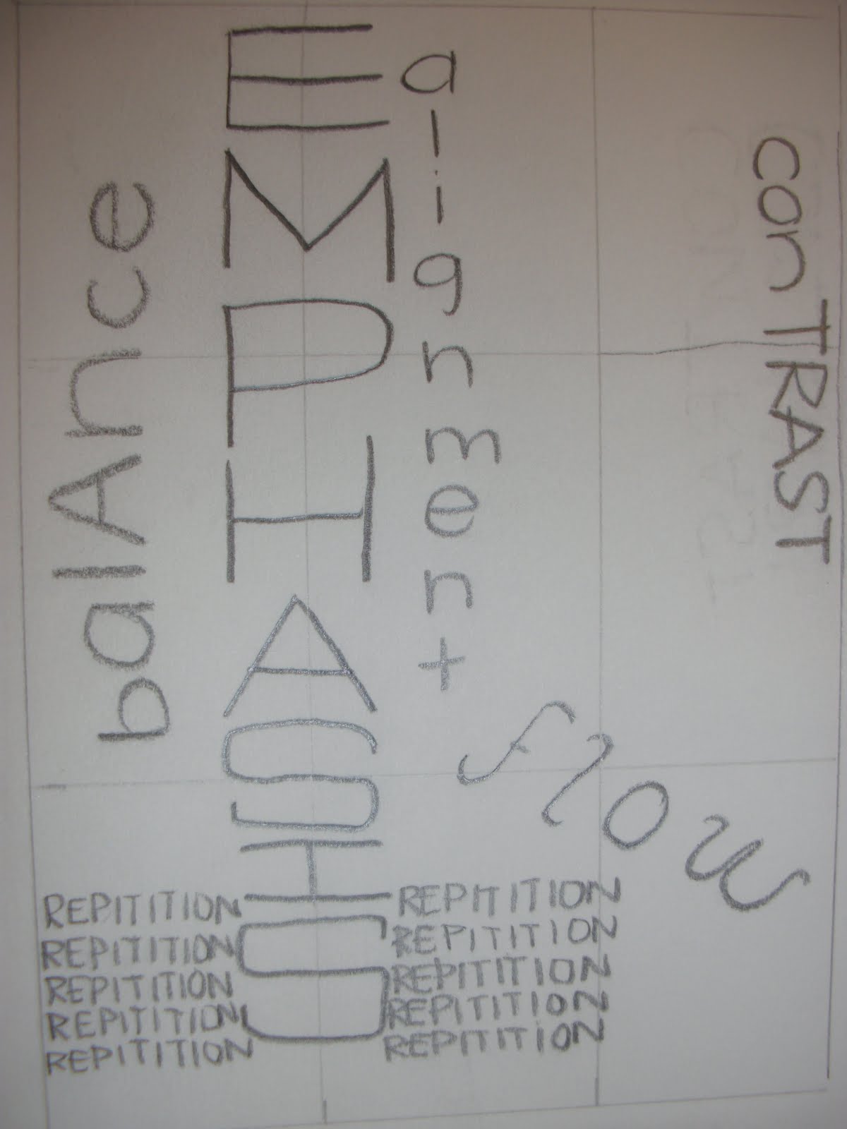
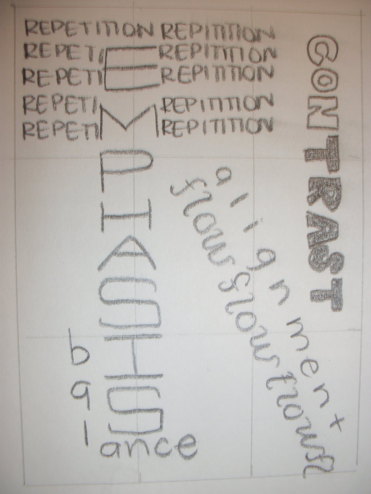
In this project I used the rule of thirds to place my words across the page. I also placed them in such a way to get your eye to move to each word because every word is as important as the other. Our other objective was to typographically alter the words so that they visually communicate their meaning. For the word emphasis i simply made it bold and the scale much larger than the others so your eye goes there first. I repeated repetition many times in the same font, size and color so you could get the feel of repetition. I made contrast visually communicate its meaning by contrasting the colors, black and white, and making the font slightly different and then replicating it as a mirror image. I made flow move across the page in a gracefully way so that it feels “flowy” and lined alignment right up next to flow following its curves. Finally, I made balance very simple, evenly spaces letters and a simple font and its along side the base of emphasis as if the word emphasis is balancing on top of the word balance. Over all I think I have a unified design and that I visually communicated all of the meanings of the words.
Wednesday, September 15, 2010


Subscribe to:
Posts (Atom)