

Tuesday, December 7, 2010

Tuesday, November 30, 2010


History Poster
WHAT: Pixar Animation
WHEN: 1986- Present
WHERE: California, United States
HOW:
-1986- Pixar Animation Studios began.
-1995- TOY STORY (first fully computer animated film)
WHEN: 1986- Present
WHERE: California, United States
HOW:
-1986- Pixar Animation Studios began.
-1995- TOY STORY (first fully computer animated film)
$192 million in domestic box office receipts and $362 million worldwide
-1998- BUGS LIFE
over $163 million in domestic box office receipts and $362 million worldwide
-1999- TOY STORY2
over $245 million in domestic box office receipts over $485 million worldwide
-2001- MONSTERS INC.
over $100 million in domestic box office in just nine days, the largest three day opening ever for an animated film
-2003- FINDING NEMO
$70.2 million opening weekend breaking box office records domestically for an animated film becomes the highest grossing animated film worldwide and the 8th highest grossing film of all time.
-2004- THE INCREDIBLES
-2006- CARS
cars was nominated for two Academy Awards including best animated feature and won the Golden Globe Award for the best animated feature film
-2007- RATATOUILLE
was nominated for five Oscars
-2008- WALL-E
the film grossed $23.1 million opening day and $63 million during its opening weekend
-2009-UP
grossed more than $731 million worldwide and was nominated for five oscars
-2010- TOY STORY 3
broke box office records with its $110 million opening weekend


Tuesday, November 9, 2010
Post-Modern


Post-Modern design is currently around to this day.
Characteristics of this design style are:
-free
-anything goes
-expresses emotion,ideas and life in a free way
-forms,shapes and text usually cluttered
Modernism/Modern Movement/New York School


Modernism was around in the 1940's.
Characteristics of this design style are:
-intuitive design
-less structured
-more free with design
-bright color usage
-uses negative space and positive space hand in hand. one is as important as the other
Monday, November 8, 2010
International Typographic Style


The International Typographic Style was around between the 1950's to the 1970's. (This is my favorite style out of them all!!) This style is very similar to the Bauhaus style of design.
Characteristics of this style are:
-follows the grid format
-strong use of Sans-Serif font
-clarity of design (simple)
-plays with the font in a variety of ways
Art Deco


Art Deco was around between 1920 and 1930's.
Characteristics of this design style are:
-straight lines
-zigzags, lightning bolt shapes
-flat, geometric, constructed shapes
-popping colors
-had a sense of elegance to the design
Bauhaus


Bauhaus design style was around in the 1920's.
The three principles to this design were:
-form follows function
-economy of form
-truth to materials
The style to these designs are very simplistic, easy to read, simple colors, and balanced. The Bauhaus design style has had a lot of impact on many individuals and on many other styles of art such as the swiss.
Constructivism


Constructivism was around between 1913 to the 1920's.
Characteristics of this design style are:
-simple colors
-use photography instead of illustrations
-abstraction
-geometric shapes attached to others making stable forms
-promote slogans and campaigns of the government during that time
Art Nouveau


Art Nouveau was around during the late 19th century to early 20th century.
Characteristics of this design style are
- intense ornamentation
-extreme curves
-hand lettered typography
The design is sort of organized chaos because the design is very simple but the ornamentation and curves make it very detailed and.
Sunday, November 7, 2010
BCC Cover Essay
The design principles : emphasis, alignment, contrast, balance, flow and repetition have been used to create a unified and balanced design that visually communicates the college mission statement and engages the appropriate audience. In my design I tried to emphasize the all around aspect of the college. I didn't just focus on one part thats better than the other I focused on the whole, so that it can relate to everyone who looks at it not just a certain group of students. The pictures I chose to use show the campus, books to represent the importance of education, and students working up close and personal which shows how hands on the school is. To emphasize these pictures I placed them in boxes that flow down the page, and to your eye, make it seem like they are popping out at you. I did this because pictures are usually the first thing a persons eye is drawn to. The pattern I chose to put as the background are shaped like the cereal honeycombs or to the mind a shape that represents bee hives or even chemistry shapes. I thought this was a perfect shape to use because Broome Community College's mascot is the hornet. By doing this I am communicating to the athletic students. For the people who see it as a shape that represents something related with chemistry this will relate to students majoring in the sciences. I repeated the shape downwards through the page crossing my pictures. The design has two strong diagonals that balance each other out and make the cover seem symmetrical but in actuality they are very asymmetrical to each other. I used the bright yellow to contrast with the white and black to make the bee hive shapes and the text pop. It is a very simple color scheme, I didn't want the colors I used to distract the audience from what the main focal point is. It took me many digital studies and mistakes to learn what works and what doesn't work. Overall I think my design works and that it is very strong.
Thursday, November 4, 2010

Tuesday, October 26, 2010


Thursday, October 21, 2010


Thursday, September 16, 2010

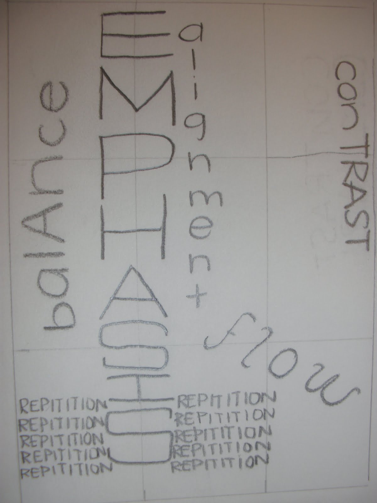
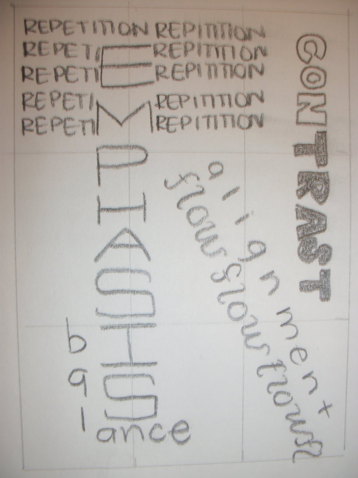
Essay for Final
In this project I used the rule of thirds to place my words across the page. I also placed them in such a way to get your eye to move to each word because every word is as important as the other. Our other objective was to typographically alter the words so that they visually communicate their meaning. For the word emphasis i simply made it bold and the scale much larger than the others so your eye goes there first. I repeated repetition many times in the same font, size and color so you could get the feel of repetition. I made contrast visually communicate its meaning by contrasting the colors, black and white, and making the font slightly different and then replicating it as a mirror image. I made flow move across the page in a gracefully way so that it feels “flowy” and lined alignment right up next to flow following its curves. Finally, I made balance very simple, evenly spaces letters and a simple font and its along side the base of emphasis as if the word emphasis is balancing on top of the word balance. Over all I think I have a unified design and that I visually communicated all of the meanings of the words.
Wednesday, September 15, 2010


Subscribe to:
Posts (Atom)